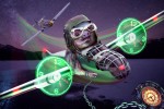
Congrats on second! This easily could have been in first.
I thought it was a great idea. Making a Rocket Jet pack out of source, and then putting it on a racoon? Who the heck does that? WE DO!! We are Photoshoppers and we make Racoons, with a jet pack, flying over a city. 🤪
I looked at your sources vs your entry and saw the source racoon didn't have a far arm. I appreciated that you had the creativity and knowledge to rebuild the arm. One can't always find the perfect sources to use, and you made a creative solution with what you had.
Thanks Rubber-Ray! You really noticed the details, it means a lot. I was worried for this little guys tail, mostly. I tucked it between his legs so it wouldn’t catch fire.
You’re right, I’ve been there many times. Spending so much time on entries, too many options. I do like this version better, but it wasn’t obviously clear why the speaker shouldn’t be there. I couldn’t really put my finger on it. But it would of been a shame if this wasn’t posted.it’s a great entry either way!
You’ve made some nice pieces here! My favorite is the bowl.....maybe the back scratcher? Anyways, the only pointer I have for you is maybe the lighting and shadows. Really you have a lot of those things in the right spot, but a little more details like rim lighting or multiple light sources could really throw this over the top. Great job, keep up the good work.
Nice job with the liquify tool. This entry really allows the imagination to run wild. My only suggestion would be the perspective of the top of the table. At first glance it appeared to be the edge of the table. By distorting the bottom anchor point you could create more depth. Great entry!
Great entry! The construction of the robot is brilliant. The left hand could use more contouring, but that’s an extreme nitpick. I do like the altered image without the speaker. Also the subtle touch of the extra light source and rim light really shows your attention to detail. Good job!
Your depth of field is a lot better, and the grain you added really brings some cohesion. Nice job!
Thank you Olga-Leslie-Suzuki, your kind words are the driving force to the work accomplished here.
This is really nicely done! The structure is crisp and well arranged. The outside source was used perfectly. The lighting is nice as well. I see you reduced the brightness of the stars above your creation, but didn’t to the right. I imagine they were distracting from the Android. A thought would be to move those stars further to the top left. Nicely done author!
Thanks for the comment George! His face doesn’t seem to be worried so I guess his fur must have super powers. Thanks for taking the time to look.
Not yet, I believe this is a feature that will be added in the future.

