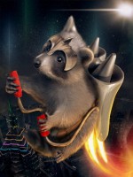
I agree, I am looking forward to the edit entry option also. I’m just excited to have a platform to show and see chops from the great community we had with Pxleyes.
Thank you Skyangel, the source image really made me put on my thinking cap.
You could of removed the pxleyes watermark, but with this effect I would have took it up a notch. Add more pxleyes logos and add grepless logos as well. It’s a photoshop themed game.
Nice job finding so many sources, that’s my least favorite thing to do. You did a nice job stitching your sources together, you just need more work on lighting shading and focus. Your background is in focus more than some of your sources in front of it. Simply by adding a blur to the background you could help the depth of field. Additionally adding a slight grain over everything will pull it together. Keep up the good work.
Nice colors and symmetry. Without any sources, it’s hard to see the original source image. Overall looks like a work of art.
Looks like you were playing around with some blend modes. The flowers could benefit from either the distort, warp or liquify tool to match the engine shape. Also the items in the sky look like they are set to maybe screen. To get rid of the box around it you could adjust the black point in levels until the box is no longer visible.
Nice construction of the ship and satellite. The family really tell a story, it looks like they’re lost. The crashed debris at the bottom could use a little more blending, especially on the left.
Very nice job with the liquify tool and defining the features in the facial region. The lighting is nice as well. The orange light with the rim light is a nice touch. The structure behind the head is a bit distracting from the overall image, but is not enough to over power the details in the face.
I like that you used the original sky background and made the engines pointy. The back engine still has the original shape behind the point which I think might distract from your final image. The body language of your creature is spot on. I think some slight shading between the structure and the sand might help as well.
Nicely done! I especially like how you adjusted the other statue to match the source image. I do think the bottom of the female statue could of used the same treatment, but it’s not a deal breaker.
Congrats on a well deserved win! Your image tells a story with the sources, lighting and composition perfectly positioned.
I like the shape you achieved with the liquify tool. It really is just a nitpick observation overall. I think the inner roof line is what catches my eye.
Really nice colors and feel to this one. I especially like the construction of the front facing houses. I could do with less liquification on the others. Good job.
Thank you very much for posting the tutorial, it’s very informative. My main editing device right now is actually an iPad with pro create, so I lack many of the tools I previously used with photoshop. Hoping for a new computer this year. I actually created my own technique for lighting many years ago. It’s very similar to the paint layer in your video. The difference is I clip the layer directly to the subject, fill the layer with black, and set the layer mode to color dodge. I then paint with color and the clipping mask makes sure everything stays in line. Honestly I didn’t even know the name of the effect I was describing, your video I enlightened me. I now know that I was trying to create rim lighting.
You took on quite a difficult challenge to make something totally different from the source photo. It takes ages with all the pre planning and deciding which section you can warp into something else. You did a great job with the eggs and the basket but the bunny made from bird feathers needs a bit of refining. I still see blue outlines from the sky around its face and ears. However, that's just a small nit pik in case you are hoping for suggestions for improvement. Overall, its a commendable effort. Well done.
Thanks for taking the time to look into the details. The blue is actually added and not from the background. The goal was to add a clipping light from the blue light source on the right. Perhaps I overplayed with the lighting and fell short on this one.

