The ICM technique gives it a very abstract feel which is a very subject art technique which some will love and others will hate. It definitely conveys a sense of commotion and unrest. The people are in a hurry and have no time to relax or interact with each other. It's a physically close city crowd who are emotionally socially distanced.
The oil paint filter makes it look very artistic. The head in the center has a sad looking expression, as if the sheep is not happy about the idea of being shorn. I think it would make a great art piece enlarged and placed in any shearing shed, wool shop or any place where they spin wool.
This provokes a lot of emotion, in me anyway. I feel sorry for the child stuck in a small basket amongst vegetables which I presume are for sale? Imagine what the child must be thinking knowing the vegetables are for sale and feeling like her mother or father has put her up for sale as well? No wonder she is sad.
Very creative to leave a hole in the painting where the kettle was taken out. The reflection of the buns and shadow of the hand on the kettle are great details. I like it a lot. 🥇🏆👍
Welcome to grepless kuvitella. I agree with you and I also almost left due to the fact that we had to list every single source. That was a real pain, expecially for those who use a lot of sources and those of us who have an old collection of stock photos on our computers and can't always remember where they came from. It seems easier here though because we can just post a link to a copy of the source photos without needing to list the exact websites they came from. I do think basic rules are necessary though to keep things fair, and so any newbie graphic artists understand what they are and are not allowed to use as sources. It's also easier to score works when we can see what kind of work has gone into them. Anyway, I look forward to seeing your work. I hope you enjoy the photoshop challenges on this site.
For those who were not previous members of Pxleyes, here is a link to the guidelines for photoshop manipulations which most previous members are still in the habit of using. http://www.pxleyes.com/guidelines/photoshop/
Yes I know and I personally score them very low when I recognise them. It is most likely because we don't yet have any definite photoshop rules on this site but I believe Staaan is working on resolving that problem.
We can use anything that is licenced as creative commons unless it has been manipulated by some other graphic artist. We are not allowed to use any copyrighted images.
You did a good job of making it look like the girl is popping out of the painting but the dish on the floor needs a bit more work. It still has a white outline on the bottom of it which needs to be darkened.
The idea is good but the cutting out of the woman needs a lot of improvement. Her hair still has evidence of the old background. Here is a tutorial to teach you how to fix it.
. Some of her foot is also missing.
Please check your source links. Some are not working.
One contest a week would be good even though I currently don't have time to do one every week. One could begin every Monday and finish on Sunday and the voting can still happen for the previous one while the next one has started.
Hi Zizounai, Some of the vintage artists works are now creative commons so it seems OK to use those as in the example by WYSIWYG in the current photoshop pop out contest and some of the entries have also included works by ancient artists. I think we should also be allowed to use any free 3D models like on turbosquid and other free 3D model sites. Not all photoshoppers can make their own 3D models due to not having any 3D modelling programs. However, I agree we should not use or copy other photoshoppers art and if we follow tutorials we should use our own sources so the end result is not exactly the same as the tutorial because then it's not unique from our own imagination. I tend to give lower scores for works which are a copy of other peoples art and are overdone with filters and effects anyway but most newbies need to follow tutorials and copy the "teachers" ideas to gain experience.
Well I'm pleased you decided to join this site. I look forward to seeing more of your work.
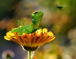
It's a shame this was late for the previous contest. It would have scored a lot higher in the previous one. I think it scored low in this one due to not much having been done with the source lizard. I love what you did with the rest though. 👍


