Hey,
Getting carded means someone checks your id for your correct age. They actually didn't believe I was 65 :)
I just started using Raw Therapee. For the same reason you mentioned plus a couple others. 1. It's free and open source app.When it is updated it's free. Which is a good thing when your retired and on fixed income.
2. It does have a few more things then Photoshop but you need Gimp to go with it.
When you open a NEF or raw file it will start out in Raw Therapee. When your done making all your adjustments.(and there are tons of them) then it will open in GIMP where you can finished it off as in Photoshop.
It's takes a long time to get use to how things are done. Spending a lot of time watching videos and learning the ropes. I've already seen a difference with the finished product.
I'm not a professional photographer so I don't need the top programs to accomplish what I want to create. These programs Have everything I need plus more.
Once I get passed the LEARNING CURVE..ugh..I should be OK
Open Source software is the way to go :)
Thank you for the kind words.
I actually got carded when I got my shots last month. My wife was a little annoyed they didn't card her.lol
Yea, I'm not trying to win anything with this pic. I just wanted to put it out there. Thanks for the tip on Photoshop, but I switched to Gimp and Raw Therapee last month, so I'm in the learning curve bubble right now. Thanks :)
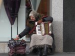
This is a great shot. I also think your work exemplifies the other end of street shooting, This I would consider an artsy approach that appeals to the beauty of clarity,symmetry, and balance etc..
it appeals more to my head and my critical side for order. While the woman with the accordion working with her hands shot appeals to my heart. Both are street shooting but at different ends of the spectrum. And then the other shots on here are street shots that fall in the middle. One leaning one way and other leaning in the opposite direction. I tend to enjoy the style this shooter takes. But like someone mention in a post on the woman >Photonut "some people would walk by/ignore the person," I think I could do the same thing with street photos like the woman. Let my (prejudices/my tendency towards clarity,symmetry, balance and beauty carry over. It's something that I always will have to keep an eye on.
Thanks.
Just want to mention that this is a street shot. It doesn't have to be crisp. If it did it might look staged. Ask yourself,does this shot stir up something, is that what you wanted to convey, is that how others feel when they see it? At least 3 or 4 on this reply felt the shot.If it is then you've done your job as a photographer and are getting closer to becoming better at it. :)
The color does pop and against the black... looks nice. But it does seem to get in the way of the picture as a a whole. If you wanted to keep the color maybe lighting it up some so it's not so contrasting.
Also you missed a part when you were cleaning up the color, you left a little behind his head,on the train. It takes away from all the work you did.
All and all I like the shot,pretty cool. I think it has all the qualities of a good monochrome shot also.
I think the shot is very good .There is a feel about it that makes it pleasing to the eye.I am sure that is why you shot it. It could be the colors; the balance between them and the shapes, or the lighting .
I prefer it from the side. I think seeing his face from the front would detract from the whole. I agree, you see something going on and you take the shot.It may not always perfect or to the liking of others, but you can always take what you have and bring out the best parts in Photoshop. I think you can coax out a lot more of what the scene has to offer with this pic. Good job.
Thank you so much for the info:)
Well thought out. I feel the same about the b&w version.
Great job:)
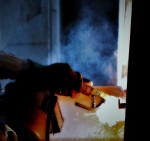
oh yea...the smoke is fine. I look at it as a transitional area from the very bright to the very dark. It like leads into it. I can see this as an art installation or a poster of some type. Again very nice work.
Would you mind sharing why you shot it in monochrome and what you were trying to convey or point out. I actually like it but what I like and what your trying to express might be two different things for this pic.
Thank you so much.


