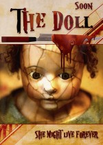
Ahah yes it could be Chucky's cousin!
I did appreciate your comments Retired, and Skyangel's too. This is not about taking this contest seriously or not, this is about communication, friendship, making this website alive too.
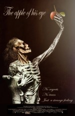
Don't feel silly Retired please, just be silly 🥴 I didn't wish to accentuate the ear but only to leave it there, as it gives a kind of balance to the composition. I feel attracted to this ear, please don't try to find in it a relation with the title though. It would be rather unnecessary in understanding the poster or even the story the movie would tell, for they result in heavy bypassed semiotics and become something more than symbols that passively awaits deciphering 😁
So, Skyangel, thank you for your comment. I really felt something was wrong but couldn't find where it was, and you got it spot on. I have now placed the ear in its rightful external acoustic meatus, as I couldn't see any reason for it to be anywhere else. I also took off the fleshy part of the nose which bothered me a bit. As a reminder, here is the previous entry:
https://imgur.com/a/YFhQtFw
Sorry Skyangel, I tried and tried but couldn't manage to edit my entry with imgur... So I have created a new entry. But I have registered your comment before deleting and here it is:
"I think this movie would come under the mystery genre since it remains a mystery as to who or what "the apple of his eye" might have been and why any artist might have created a statue of a skeleton and placed a real apple in its hand. The text has everything needed on a poster and is easily readable. The only thing that looks wrong is that ear. It looks out of place because it is a fleshly ear on a skeleton and besides that, it is in the wrong place. It appears to be on the back of the head instead of on the side where it is supposed to be. See the circular gap near the top of the jaw bone? That is the "external acoustic meatus" and that is where the ear should be if you want to add the fleshly ear at all. https://i.pinimg.com/564x/6b/10/7c/6b107c973b3b258b210f52e58894dbee.jpg
Personally I would leave the fleshly ear out and just cover the area with hair so the skull looks like it's wearing a wig but you are the artist and you might have good reasons for putting that ear where you did?"
Here is what I found about movie teaser posters: https://postergrind.com/whats-the-difference-between-teaser-posters-and-movie-posters/
Selective colour is well done and the saturation and post-processing are spot on to bring us up close and personal with this Czech denizen! I would purchase this photo to hang on my wall in my recreation room, it is wall-worthy. Simply a gorgeous post.
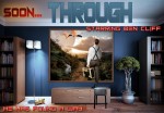
A love story about someone waiting for three hours for a call and getting shot for three hours? How does anyone shoot another person for three hours and why? I think it only takes one bullet to kill someone with a real bullet and that doesn't take 3 hours. It makes me wonder if his movements and reactions was being secretly shot with a hidden camera which would explain the deceit? It's an excellent play on words which leaves the reader wondering. Your movie title is well done. The white outline makes it easily readable. The sentence under it is also easy to read but the credits at the bottom need a brighter font which contrasts with the dark background. Dark on dark is very hard to read.
Thanks Skyangel for your comment (and all your comments by the way, you made several people happy today). I blurred the credits on purpose as they belonged to another movie, I just took off some too popular names which had nothing to do there and added my "actor" name which is Andy Mandigo. And... hoooooops... by shooting I didn't mean with a gun or any weapon, but with... a camera 😮 😁
Thank you Skyangel. No other credit indeed, no room for them. Take it as a teaser, not a proper movie poster 😉
A movie about a man who can walk through walls into photos or paintings seems like it is in a fantasy adventure genre. It makes me wonder what adventures he will find along that road and whether he will just walk through the one painting or does he go through more of them? You have a good clear title and the name of the main characters but you have not included other credits which are generally found on a movie poster.
https://zevendesign.com/5-steps-creating-movie-poster/
Staaan calls this "removing dead pixels" 😁🤣😃😅😆😉


