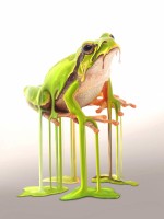
Really nice source selection and embossing style. Very subtle but very effective. Good job!
Really nice blend and overall color. Only nitpick is some cloning smudge on both sides of the tower. The texture overlay really brings everything together. Good job!
I do understand the motion blur, but wonder if a little less blur on the hand might look better? The background looks like it is cut off at the bottom, but that net looks like it was difficult. It really took me a while to figure out how I would replicate it. Good job!
Thank you for looking at the details and commenting. I agree with both of you about the candle top. I have posted my updated version with my sources if you would like to see it. I just decided against reposting for now.
Nice job blending your sources. She looks like she’s trying to hold her face from falling off. One suggestion would be some highlights on the edges of the face near the candles. Good job!
I really like the drips coming from the back of your head. I do think the flames might take too much attention away from your face. I find myself wondering what it would look like with a clean whitish background and your head centered. Overall great job!
The edit definitely looks better with the defined edge. Good luck author
I’m sorry, there doesn’t seem to be an edit button. Perhaps this will be an option the site creator will add in the future. One can only hope.
Overall, this looks nice. Couple nitpicks would be the liquify tool being pulled through other areas of the body. To prevent picking up the other colors, you could make a selection of the area you’re liquify and move it to another layer. Also the drip from the right pinky is flowing in front instead of behind the arm. I like that you added clipping light on the right of the model. Great job!
Overall I like the selection and layout of your sources. I might of chose to keep the fabrics on the ground from your boy source. Removing it messed with the boys back foot. I really like that you removed the extra shadow from the chair which allows a more cohesive shadow with the boy. Good job!
Nice job with the depth of field. I would suggest a line in the vinyl where it starts to flow from the table. Good job.
Thank you for the suggestion! I made some alterations, but it doesn’t seem like there’s an edit option.
I was an active member on pxleyes and just found this site. I was wondering if and what rules there might be for contest entries.
- «
- »


